












Description
Custom Kraft Vial Boxes That Tell the Brand Story Before the Product Is Opened
A clinical white SBS carton says pharmaceutical. A rigid matte black box says luxury. A natural brown kraft box says something different: it says the product is plant-derived, minimally processed, and from a brand that means what it says about ingredients.
For essential oil brands, herbal supplement makers, aromatherapy companies, CBD brands, and organic personal care lines, that signal is not incidental. It is the first communication the customer receives, and it needs to match what the label says inside. A beautifully formulated organic essential oil blend in a glossy white carton creates a subtle contradiction. The same vial in a natural kraft box confirms the story.
Custom kraft vial boxes from Hexa Custom Boxes are built for the brands where the material is the message: the right structural format, the right insert, and the right print approach for uncoated board.
Natural Brown Kraft vs White Kraft: The Decision That Shapes Everything Else
This is the first specification decision for a kraft vial box and the one no competitor explains clearly.
Kraft comes in two primary forms for vial packaging, and they behave differently in production, differently in print, and differently on the shelf.
| Feature | Natural Brown Kraft | White Kraft |
|---|---|---|
| Surface | Unbleached, warm brown, slightly textured | Bleached, smooth white surface |
| Print behavior | The natural brown tone acts as an underlying tint. Lighter colors appear subdued, while darker colors like black, navy, and deep green print with good contrast. | Colors reproduce with much greater accuracy, gradients stay smooth, fine detail holds |
| White elements in design | Require a white ink underlay pass before color layers, adding production complexity | Print directly on white surface without underlay |
| Structural strength | Unbleached brown kraft retains longer cellulose fibers which contribute to superior durability. The bleaching process can sometimes slightly weaken white kraft fiber compared to unbleached natural kraft of the same basis weight. | Good structural strength, slightly less than unbleached equivalent |
| Brand signal | Natural, organic, artisanal, eco-forward, plant-derived | Clean, clinical-natural, premium eco, farm-to-shelf |
| Best for | Essential oils, herbal supplements, aromatherapy, CBD, unprocessed botanicals | Organic skincare, clean beauty, premium natural wellness |
For most brands in the essential oil and herbal supplement category, natural brown kraft is the right starting choice. The warm texture communicates what the product is before the label is read. For brands in clean beauty or premium organic skincare where print accuracy and a cleaner aesthetic matter, white kraft gives better color fidelity while retaining the sustainable material story.
The Print Rules for Natural Brown Kraft
This is the design guidance that prevents an expensive print disappointment and that no vial box competitor addresses.
Natural kraft paper absorbs ink more than coated papers, which can dull bright colors and lower contrast. Dark inks like black, navy, or deep green work best.
Three practical rules for designing on natural brown kraft:
Rule 1: Build the design around dark ink on kraft. Black ink on natural brown kraft prints with strong contrast and a sharp brand identity. Deep green, navy, and dark burgundy also perform well. These combinations are not a compromise: they are the design aesthetic that makes natural kraft packaging look intentional and premium. A single-color dark ink logo on uncoated kraft is often more effective than a full-color design fighting the brown tint.
Rule 2: Test every color before committing to production. Ink behaves differently depending on what it is printed on, and the gap between kraft and white is significant if color accuracy matters. A coral, teal, or gold that reads beautifully on a white substrate will look muted and shifted on natural brown kraft. Request a printed sample of your color palette on the actual kraft stock before finalizing the artwork.
Rule 3: Use a white ink underlay for full-color designs. If the brand requires full-color accuracy on natural brown kraft, a white flood coat is applied as a base layer before the color inks. This creates a surface closer to white cardstock for the colors to sit on. Applying white ink as a base layer before printing other colors allows the final result to pop, similar to how these colors would appear on white cardstock. This adds a production step and a small cost, but it is the method that makes a full-color design reproduce correctly on uncoated brown kraft.
The Brand Categories Where Kraft Vial Boxes Work Hardest
| Product Category | Why Kraft Fits | Natural vs White Kraft |
|---|---|---|
| Essential oils (lavender, eucalyptus, tea tree) | Earthy material matches botanical origin story | Natural brown kraft standard |
| Herbal supplement tinctures and extracts | Plant-derived product, artisanal positioning | Natural brown kraft standard |
| Aromatherapy blends and diffuser oils | Sensory-led category, organic aesthetic | Natural brown kraft standard |
| CBD and hemp-derived wellness vials | Natural, plant-forward positioning | Natural brown kraft or white kraft |
| Organic skincare serums and facial oils | Clean beauty, eco-premium positioning | White kraft for color accuracy |
| Homeopathic and naturopathic preparations | Natural health, minimally processed | Natural brown kraft |
| Apothecary and botanical cosmetics | Heritage, craft, botanically-inspired | Natural brown kraft |
| Farm-to-shelf tinctures and botanicals | Origin story packaging, farmer’s market to DTC | Natural brown kraft |
Format Options: Tuck-Top, Two-Piece, and Sleeve
Kraft vial boxes are available in the same structural formats as SBS cartons. The format choice depends on the product presentation requirement and the channel.
| Format | Structure | Best For in Kraft |
|---|---|---|
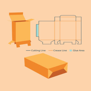
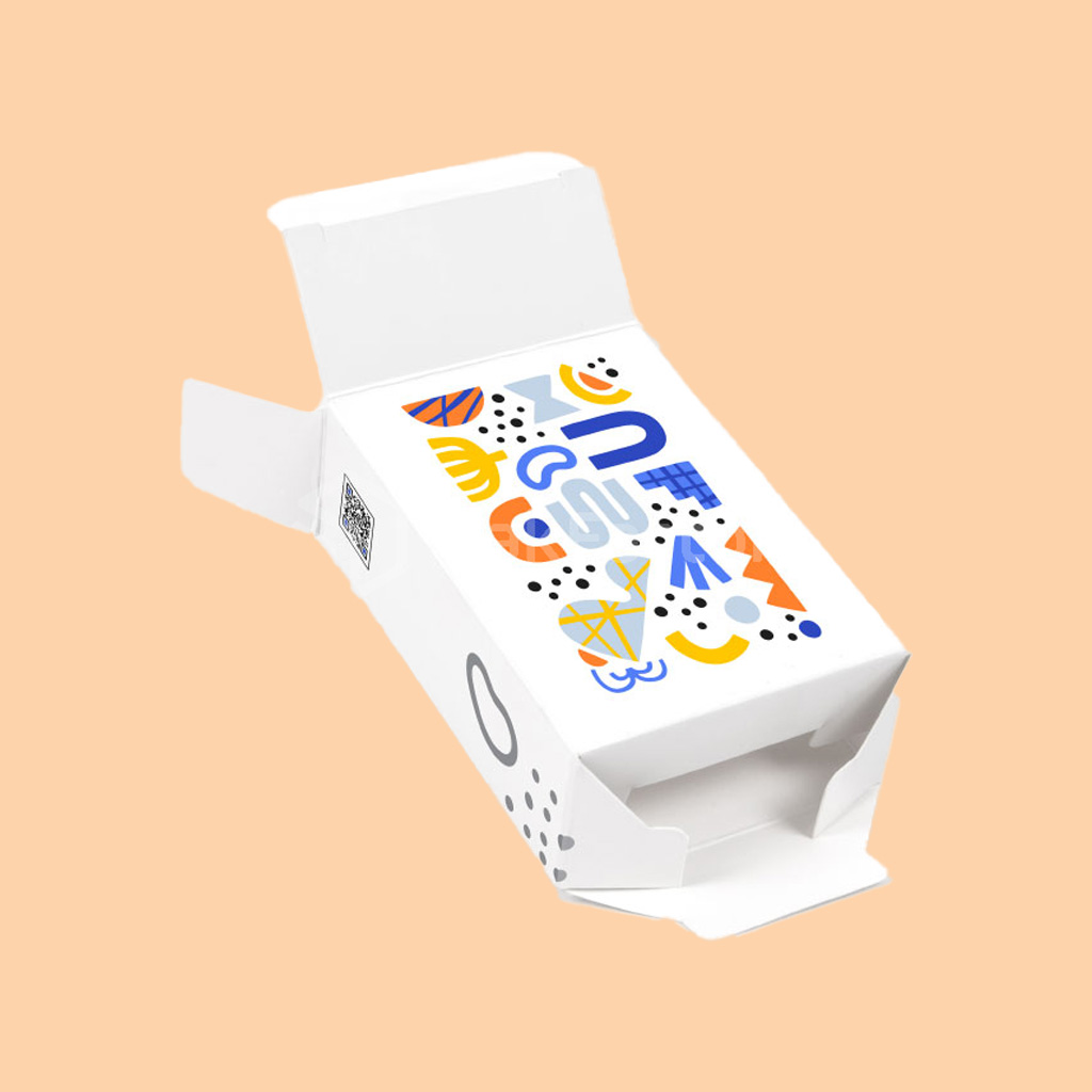
| Reverse tuck-end | Single die-cut sheet, folds flat, reverse tuck closure | Most economical kraft format, high-volume retail, pharmacy |
| Straight tuck-end | Single die-cut sheet, same-direction tuck | Clean front panel, retail shelf display |
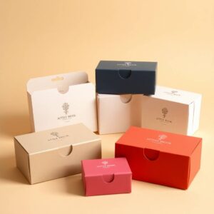
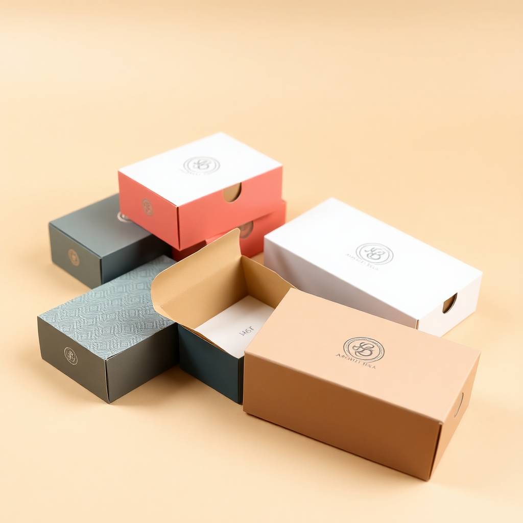
| Two-piece lid and base | Separate lid and tray | Premium gifting, apothecary presentation, DTC unboxing |
| Sleeve and tray | Printed sleeve slides over kraft tray | Clean premium reveal, botanical and wellness brands |
| Auto-bottom tuck-top | Pre-glued base for faster assembly | High-volume packing lines, pharmacy dispensing |
For most essential oil and herbal supplement retail, the reverse tuck-end or straight tuck-end in natural brown kraft is the right starting format. For gifting and premium DTC, the two-piece or sleeve-and-tray format creates a more intentional unboxing moment.
Insert Options for Kraft Vial Boxes
The insert protects the vial inside the kraft outer. Insert material choices that work with the kraft brand story:
| Insert Type | Brand Alignment with Kraft | Protection Level |
|---|---|---|
| Natural kraft cardboard cradle | Complete material consistency, fully recyclable | Good for light vials and short transit |
| Recycled cardboard dividers | Eco-consistent, recyclable | Good for multi-vial separation |
| Molded pulp tray | Most eco-forward, home-compostable grades available | Good cushioning, natural aesthetic |
| Natural EVA foam | Functional protection with neutral appearance | Best impact absorption for glass |
| FSC-certified chipboard insert | Certified sustainable, printable surface | Good structural hold for display |
For brands with a strong sustainability positioning, a molded pulp insert inside a natural brown kraft box creates a fully eco-consistent packaging system with no plastic components. For brands where glass protection is the priority, pair the kraft outer with a natural EVA foam insert.
Sustainability: What Kraft Actually Delivers vs What It Signals
This is the honest conversation most suppliers avoid and that buyers increasingly need to have.
The assumption that kraft automatically means greener is widespread and it is worth separating perception from fact. Kraft’s brown unbleached surface reads as natural and unprocessed, which is why it has become a visual shorthand for sustainability. Unbleached kraft does skip certain chemical bleaching steps in processing. It is also generally recyclable and biodegradable through standard paper waste streams.
What kraft delivers for sustainability claims:
- Recyclable: Natural kraft board is curbside-recyclable in most US municipalities.
- Biodegradable: Uncoated natural kraft decomposes through standard composting processes.
- FSC-certified options: We offer FSC-certified kraft board for brands with chain-of-custody requirements.
- Aqueous coatings only: We use water-based aqueous coatings on kraft, not gloss UV coatings, which maintain the recyclability of the finished box.
What to verify before making sustainability claims: lamination, foil, and UV coatings applied to kraft reduce recyclability and in some municipalities prevent curbside recycling entirely. If recyclability at the customer’s door is a brand claim, specify aqueous coating only and avoid lamination and metallic foil.
Printing on Kraft for Essential Oil and Aromatherapy Applications
One practical note specific to essential oil and aromatherapy vial packaging: the aromatic compounds in essential oils can affect coatings and laminates that come into contact with the oil over time.
For kraft vial boxes where the essential oil vial might sweat or where a stopper might allow trace vapor: specify an aqueous or UV-cured coating on the interior base panel if the insert does not fully isolate the vial from the board. This prevents terpene compounds from the oil affecting the board over extended shelf storage.
For wrapped vials with sealed caps and stoppers: standard uncoated kraft is appropriate and no additional interior coating is required.
Size Reference for Common Kraft Vial Applications
| Application | Typical Vial Size | Suggested Box Interior (W x D x H) | Format |
|---|---|---|---|
| Essential oil 10ml roller | 10ml, 17mm wide, 60mm tall | 22mm x 22mm x 75mm | Reverse tuck-end |
| Essential oil 10ml euro dropper | 10ml, 22mm wide, 65mm tall | 28mm x 28mm x 80mm | Reverse tuck-end |
| Herbal tincture 30ml | 30ml, 30mm wide, 90mm tall | 36mm x 36mm x 110mm | Straight tuck-end |
| CBD oil 15ml dropper | 15ml, 26mm wide, 80mm tall | 32mm x 32mm x 100mm | Reverse tuck-end |
| Aromatherapy blend 5ml | 5ml, 18mm wide, 50mm tall | 24mm x 24mm x 65mm | Reverse tuck-end |
| Apothecary gift set duo | 2x 10ml vials | 52mm x 28mm x 80mm | Straight tuck or sleeve |
All dimensions confirmed against your actual vial before production. Vial dimensions vary between manufacturers, so we always verify from a physical sample or caliper-measured spec sheet.
Packaging Expert Tip: Match the Ink to the Kraft Story, Not to the Brand Guideline
Here is the design mistake that costs kraft vial packaging its most powerful advantage.
Most brands brief kraft packaging the same way they brief white carton packaging: they hand over the brand guideline with the Pantone color palette and expect the same result on brown kraft that they get on white SBS.
(A skincare brand built around clinical minimalism on a white substrate will look and feel very different from one built around earthy botanicals on kraft. Both can be compelling. The question is which one your customer expects when they picture your brand.
For kraft specifically: the most effective designs do not fight the brown. They embrace it as a color in the palette.
Brief the design for three color maximum: your dark brand ink (black, dark green, navy, deep burgundy), the natural brown of the kraft as the background, and one optional warm accent (warm gold, terracotta, rust). That palette is what makes a natural kraft vial box look considered and artisanal rather than like a design that was built for a different substrate and forced onto kraft.
If the brand palette is pastel, cool-toned, or relies on white space, consider white kraft instead. The goal is alignment between the material’s character and the design’s character. Kraft with the wrong color palette reads as a mismatch. Kraft with the right palette reads as a brand that understood what it was doing from the start.
What Every Hexa Order Includes
These terms apply to every order without exception or fine print:
- No die charges and no plate charges, zero hidden setup fees
- Low 100-box minimum for test runs or full production
- 8 to 10 business day turnaround from approved artwork
- Free dielines and ready-to-use templates
- Free 24/7 structural and print support from real packaging people
- 100% recyclable board stock on every order
Packaging That Confirms the Product Story Before the Label Is Read
Natural brown kraft or white kraft. Tuck-top or two-piece. Molded pulp or EVA foam insert. The material combination that tells the right story for the right brand from the moment it lands in the customer’s hands.
Get your free quote today. No setup fees, low 100-box minimum, delivered in 8 to 10 business days.
- 👉 Request a Free Quote
- 📞 Talk to a packaging expert — free 24/7 support
- ✉️ Email us anytime: hello@hexacustomboxes.com